Overview —
The United Nations launched a global campaign to urge leaders, businesses, communities, and individuals to end poverty and protect the planet by 2030.
The United Nations General Assembly asked my team to design and develop a microsite for its Keeping the Promise campaign. The campaign goal was to set the world on a more equal and sustainable path. My team partnered with the UN to develop a clear strategy for getting user engagement through the microsite.
Role —
Duration —
Team —

THE CORE CHALLENGe
How can we globally engage leaders and citizens to commit to United Nation's Twelve Promises
"More than ever before in human history, we share a common destiny. We can master it only if we face it together. And that, my friends, is why we have the United Nations."
-Kofi Annan
THE PROBLEM SPACE
Design System Challenge
The UN designer provided a design system including about 20 different brand colors. Each color was super saturated and didn’t necessarily all vibe together, so I decided to pare down the color scheme to make the assets and icons better work together.
Time constraint Challenge
I also needed to design something that a developer would be able to implement easily and quickly—within three weeks. This required total collaboration with the developer, bringing ideas to him first before getting sign off from other teams.
Incomplete Data Set Challenge
We needed to display an abstract ‘essence’ of data, so to speak, without having access to any real dynamic data. This is where we looped in someone from our video team to help us emulate a globe lighting up with colors, appearing like it might be happening in real time in correlation with each promise. The video team also helped us create an intro animation for the landing page.
Design phase I
Concepting without data
After the client instructed us that we wouldn’t have any data for an interactive map, which was our initial thinking on the project, we had to pivot to a new idea to pitch them. Our runway time was only three weeks, so I had about a few days dedicated to designing, and at this point we still needed them to sign off on a concept. We sent over a few written concepts, which they rejected. We realized that we were still passionate about a concept that involved some kind of global map, even without available dynamic data, which popped back up in later brainstorms.

Pencil sketch of the approved concept's UI

Digital wires of the approved concept's UI
Designing with complexity for simpler coding
Each of these challenges kicked my design process into emergency problem-solving gear, which gave me the idea of having the navigation be front and center. This would allow the user to focus on just one Promise at a time, limiting the color palette, and give a little more heft to the project in place of data. Additionally, this allowed the dev team to simply copy and paste code for each of the 12 Promises, instead of having to customize each one for functionality, and thusly streamline development time.
Design phase II
Prototyping with accessibility in mind
The first iteration of the site shows a mockup spotlighting the globe concept, which would rotate and animate colors lighting up as you scroll. This gives the impression that participation and coordination may be happening in real time. Further, by connecting the animation to scroll, this would achieve improved accessibility by tying motion to specific user control.
Another improvement made here is in removing the background color segmentation between the category and globe engagement sections. By doing so, this removed any accessibility issues around color contrast against the white logo.

The first iteration of the site shows a mockup of the globe concept, which would rotate and animate colors lighting up as you scroll.
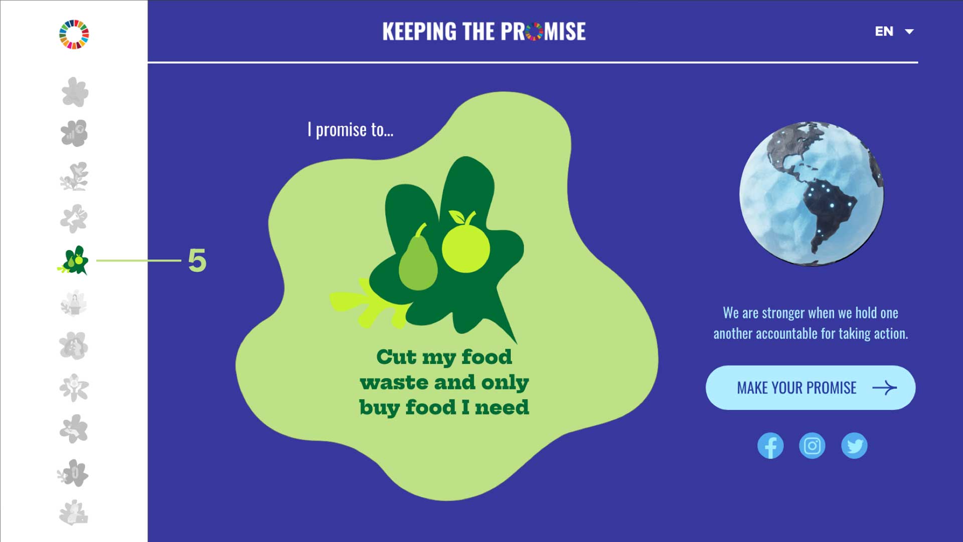
The final version showcases the finalized globe in a papier-mâché style.
Design phase III
Prototyping responsively
To make the long scroll concept work for smaller devices, we had the idea to make a 'Promise menu' homepage for mobile screens, that drop you into each individual section.


Results


